Kiki Interiors - Decor and Staging

Tuesday, October 29, 2013

Trend alert: Kitchen backsplash tiles

I personally love a fabulous back splash in a kitchen.  In my opinion it is the cherry on top!  It is a great way to add visual interest and it can easily be a connector piece to pull the whole kitchen look together.  There are so many different options - glass, stainless steel, marble, mosaics and more.  But we starting to see a new trend emerge...over sized tile back splashes. 
 
If you watch the TV show Property Brothers, you've probably seen them do this a lot lately.  With the right colour and materials you can get a very chic and streamlined look without busting the bank.


Seen in these images, a very sleek modern kitchen with some wood elements but the counter top give it a very clean and streamlined look.

Labels: , , , , , ,

Budget Friendly Bathroom Updates

We use the bathroom everyday and if you live in an older home, like I do, you really do notice the age of your home in the hot spot areas like the bathroom and kitchen - the faucets, the finishes, the colours, materials and more can really age a space but if you don't have the desire or budget for a full renovation job, check out these easy updates that can really bring your bathroom up to speed.

1 - Replace that ugly faucet especially if it is brass.  Opt for something simple and clean in a chrome finish.  It's an instant face lift for the whole room. It's a relatively easy fix but if you don't have a clue, call a pro. Be sure to pick the faucet that matches the number of holes you currently have.

2. Granite, stone and quartz are stunning but that beauty comes with a price.  If you love the look but can't pay the price look into having your current counters resurfaced with 1/4 inch veneer of granite
Rachel Reider Interiors  Beautiful bathroom with gray double sink vanity accented with nickel hardware and white marble coun...:

3.  Jazz up those mirrors.  Replace the boring and plain mirrors that came with your home with a framed version.  Try local home decor stores for some inexpensive options.  They really give the bathroom a more custom look


Bathroom Vanity. Timeless Bathroom Vanity Design. #Bathroom #Vanity #Interiors:
4. Ugly floor? Tiling is a messy job and the cost might not be in your budget.  Look for an over sized rug with some pattern or texture for the space.  It is perfect for when you step out of the tub plus it will distract the eye and be the focal point on the floor.

5.  In the 1980's we saw a lot of 'almond' or 'bisque' tone tubs, toilets and sinks.  You can have the tub and sink re-glazed in a pure white.  Replace the toilet for a more efficient one you can find very affordable options plus it will help you bills in the long run.  I've done this is my current home and wow, it really brightens up the room and makes it look fresh and clean.

Airy bathroom with white silver clawfoot bath tub:

6. Try paint.  spruce up the space with a paint job.  Be sure to pick a colour that suits the feel you want - too bright can be jarring and too cold is exactly that.  I like lighter soothing tones in a bathroom.

7. Don't forget the hardware.  If you have updated your faucets you really should do the same for your knobs and handles.  Opt for the same or similar finish to the faucet. and a simple style is best - this is a very DIY that only takes less than an hour.

 Christopher Lowell says:"Christopher Lowell Hardware is the jewelry of a room that can update, accessorize and draw the eye away from what you don't want to focus on--just like on people. Who knew?"

8.  Accessories are an easy update with no mess.  Shower curtain, soaps, plant, art and a beautiful vase are small pieces that make a big impact in any room.

9.  Don't forget the lighting.  Often we only see light fixtures over the vanity - look for one where there are multiple heads and ones that can be directed to fill the room with light


Labels: , , , , , ,

Monday, October 28, 2013

DIY Project - Slim End Tables

So I was working on a model condo suite recently and like most condos it was a smaller space. We were able to have a good size sofa which provided lots of seating but because of the larger sofa we had to get creative with the end tables.  So we looked around for something that had a long and lean look but that still fit with the over style we had in the condo suite.  It was a challenge.


So we did what we usually do and got creative.

We found some over sized, tall and clear glass vases at HomeSense.  We also found some great faux flowers and branches.  With some arranging and some twisting we were able to have a modern yet soft looking floral set up and we placed the vase upside down, so it covered the floral piece.  It has a weightless and modern look, you get the surface space (we need for lamps to provide extra lighting) without the bulk


This is an easy and very cost effective way to get truly unique end tables.  You can also put seasonal items like pumpkins and gourds inside.  You could go 'old lady' vintage with stacked tea cups, wood sculpture or candle sticks would also look great.  You get some surface space for a glass of wine or a lamp, too.  The clear glass makes it look and feel weightless, too.


Although not the best shot you can see the lamp sitting on the end table made of a clear vases.

This is great for condos or really any tighter space that could use some end tables.  A spare bedroom is an ideal location, too.

Labels: , , , , , , ,

Friday, October 25, 2013

Curb Appeal Combinations

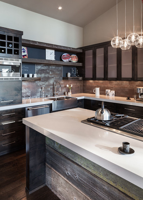
A huge part of presenting your home for sale on the real estate market is curb appeal and if you are considering selling your home any time soon you really do need to spend some time thinking about how your home looks to passers by.  Of course we all know the expression "don't judge a book by it's cover" but in the real estate world that just does not apply.  If a home look unkempt and unruly on the outside, buyers just assume the inside will be the same and they just pass by.

Not sure where to start or what to do?

Start with basic maintenance: trim shrubs, weed gardens, cut the grass, rake the leaves, shovel the snow, and salt the walkways.  But also look at light bulbs, exterior house numbers, paint and windows - are they in good working condition and do they look good.

The exterior of a home and it's curb appeal is instant advertising.  Ever seen a home in your neighbourhood that you always thought was stunning from the streets and wondered what the interior was like? Well, buyers do that very thing.

If you want to do some exterior updates, here are some easy combinations for you.

If you have a coastal inspired home, this combinations are for you.
Exterior colours- siding: Pewter Mug by Behr ; Trim: Swan Wing by Behr; Shutters: Beluga by Behr and Front Door: Awning Red by Behr


Try a 15 windowpane French Door to let in plenty of natural light.

Try painted ceramic house numbers

Add a lamp post with a 3 panel lantern light post and a built-in cross bar to hang a potted plant or flower pot.


For gorgeous gardens, hostas are perfect for either side of the front steps.  they are easy to grown and come back bigger and bigger every year.  Add some ferns too for an even lusher look.  For hedges, consider tall and dense Skip Laurel Hedges can reach about 10 to 12 feet, they offer privacy and make a perfect back drop for plants and flowers.  Keep to a tight colour palette with your florals - pink New Guninea impatiens, blue hydrangea and pink astilbe add colour, texture and visual interest.


If your home is more English country side with a storybook feel this combination is for you:
Stucco: Standish white by Benjamin Moore; Trim: Rockport Gray by Benjamin Moore; Shutters and Door: Crimson by Benjamin Moore

Roof shingles: Get the look of cedar shingles without the expense and maintenance.  Try an asphalt option with mixed tones.  Stick with golden brown tones.

Hanging planters add warmth to a space, try a hanging planter in natural moss with some iron work accents to play into the storybook look.  Plant petunias and million bells in pinks and purples.  You can plant in the late spring and if you maintain them they will bloom up and into the fall.

Add some more colour to your garden with Japanese Maples - it's reddish purple leaves really standout in an all green yard


If you have a more nautical home with a contemporary flair, this combination is for you.

Siding and trim: Spanish white by Benjamin Moore; Shutters: Rodeo by Benjamin Moore; Front door: Northern Cliffs by Benjamin Moore


Look for a front door in a style with a raised molding and a window in a single panel.

A porch light in an aged bronze finish with clear glass panels.  It adds some more traditional element to the exterior.  Make sure to match the finish on all of the hardware like the mailbox, grip set and address numbers.

Clean and simple house numbers have a classic and timeless style especially against a white home.

For the garden, a great combination of terra cotta pots filled with ivy and spike plants and pops of colour from begonias look fresh especially against the white and gray exterior.


If you have a  more traditional Tudor style home with accents of brick, siding and stucco, try this combination.

Siding and stucco: Mega Greige by Sherwin-Williams; Trim: Warm Stone by Sherwin-Williams; Shutters: Take Five by Sherwin-Williams; Front Door: Tricorn Black by Sherwin-Williams


Planted urns on the front steps filled with purple geraniums, trailing margarita and pink begonias add a splash of colour. 

For lighting, try a lantern in forged iron with a pagoda shaped top

Labels: , , , , , , ,

Thursday, October 24, 2013

Picture Perfect Paint

Looking for the right paint colour for your home or space?  Look no further these are some of the best hues out there.

Neutrals:

- Rockport Gray by Benjamin Moore - a perfect neutral for any space, it has a richness without being too deep

- Mega Greige by Sherwin-Williams - sophisticated and a warmer alternative to grey but still very urban

- Urban Sunrise by Valspar - a cooler gray but a great neutral for an all over tone in a space

- Intellectual Gray by Sherwin-Williams - a warm and rich gray and would look beautiful in a space where you want a bit more drama like a master bedroom or a dining room


Cool Blues:

- Marlboro Blue by Benjamin Moore - perfect in a boys' bedroom it would grow with your child no matter how their interests change

- Celebration Blue by Valspar - a deep denim with a nautical feel would pair beautifully with light wood and textiles


Brighter Blues:

- Take Five by Sherwin-Williams - a bit bright for a room but perfect for polishing up a garage sale find like a chair, desk or side table

- Waterscape by Sherwin-Williams - a very vintage aqua tone.  If you like the 1950's look this is for you!

- Blue Danube by Benjamin Moore - a more sophisticated blue would be great in a home office space especially if you want a nautical feel, see image below


Gorgeous Grays:

- Rodeo by Benjamin Moore - soft and light a great all around neutral tone, see image below

- Liberty Gray by Behr - a blue grey with a lot of depth, would be great as a front door colour, accent wall or for furniture

- Pewter Mug by Behr - another great neutral in the gray family

- Northern Cliffs by Benjamin Moore - a more sophisticated true grey will add some drama to a space and paired with an ultra white trim just stunning and rich


Pretty Pinks:

- Sweet 16 Pink by Benjamin Moore - perfect for a nursery or a little girls' room the pink is soft and light

- Nancy's Blushes by Farrow & Ball - a deeper pink but not too bright and blinding

- Deep Carnation by Benjamin Moore - looking for a punch of colour, this is it!  Great for a fun furniture piece, see image below


Great Greens:

- Rosemary Green by Benjamin Moore - would be a great pop of colour for someone looking for a country look or organic element in a space

- Kentucky Haze by Benjamin Moore - almost a neutral, a sophisticated green that's richer than the 'sage' green that was once so popular, see image below

- Holly Leaf by Martha Stewart Living - very deep perfect for a kitchen island or a front door.  Warmer than black but really dark


Wow Whites:

- Ultra White by Valspar - perfect for trim and wainscoting, see image below

- Spanish White by Benjamin Moore - a warmer white but definitely not a cream could be all over colour or just trim work

- Swan Wing by Behr - not quite a true white but still pure


Deeper hues:

- Temptation by Benjamin Moore - perfect for a front door or any room in need of a statement

- Kendall charcoal by Benjamin Moore - a warmer gray but deep and dark again great for a door or even commercial spaces.  Try it in a powder room, too

- Warm Stone by Sherwin-Williams - a beautiful warm brown for a front door, powder room or a library space

- Graphite by Benjamin Moore - a purple-ish brown perfect for a front door or a space needing some drama.  Some of my clients did their dining room in this colour.  See image below.


Labels: , , , , , ,

Monday, October 21, 2013

Magic Carpet

All About Area Rugs - shopping, sizing and arranging tips

1.  To figure out your ideal rug size, measure the room's width and length and subtract 2 or 3 feet from each dimension.  The result is what you should aim for.

 Spiral Mosaic Rug

2.  A good rule of thumb when deciding where to put a rug; make sure at least the front 2 legs of each piece of furniture in the space sit on the rug.  Otherwise, it will just look like a floating piece of fabric in the space and the room will feel cluttered and small.

3.  Nothing beats the quality of a wool rug and yes, it is the most expensive kind but it also feels the softest, has the richest colours and wears (over time) the best.  If wool just isn't in your price range try a nylon or synthetic blend for a similar look for less.

 Brazilian Cowhide Rug
4.  Natural materials such as sisal, jute and sea grass work with any colour scheme but keep in mind they have a casual look and can feel a bit scratchy.  A wool or nylon rug that mimics the nubby texture of a natural fiber will feel better on your feet.

5.  Flat-women kilim and dhurrie rugs, which are usual made of cotton or wool, are a fun way to add pattern to a room (I have one in my from entry).  But they do not hold up as well as rugs with a pile.


6.  Standard rug sizes range from 3 feet by 5 feet to 9 feet by 12 feet.  If you need a larger one or have an oddly shaped room consider getting a piece of carpet cut to size and bound (I did that in my kids' bedrooms)

7.  Don't forget a rug pad!  It will prolong the life of your rug and the floor underneath.


Labels: , , , , , , , ,

Sunday, October 20, 2013

How 26 designers gave back to Ronald McDonald House

This is something I've always wanted to do...I hope one day I get to use my talent and skill set to help others....


New York Cottages & Gardens recently unveiled its Project Design 2013, wherein 26 interior designers—including Bunny Williams, Jamie Drake, and Anthony Baratta, as well as younger talent like Tilton Fenwick, Nick Olsen, and Jon Call—brought vibrance to the Ronald McDonald House of Long Island. Professionals coming together to pretty up a single abode has become rather common in the design industry, but "showhouse" isn't quite the right moniker here, as the newly jazzed-up interiors will be used by the families of children undergoing medical treatment at the nearby Children's Medical Center of New York. Where there were once pink drab walls and flat green bedcovers there are now custom wall finishes and bed linens half a foot thick, not to mention Starck Ghost chairs and Saarinen tables. All 18 bedrooms got a redo, as well as the kitchen, common areas, and laundry rooms.

 
Though this location of the Ronald McDonald House provides free housing to families already ravaged by medical costs, before the designers got their hands on the place the accommodations—think bare, putty-colored walls and generic pastel art—weren't exactly deluxe. Now, though, the house has gone from a ho-hum medical facility to an environment bursting with color, with each room flaunting its own personality. The laundry rooms boast luxurious wallpaper—one even has the moody fish wallpaper spotted in this year's Kips Bay Showhouse—the bedrooms show off elaborate headboards, and the sunroom pops with candy-colored furniture. Other highlights: a playhouse inside Anthony Baratta's sun room, a floral ceiling in the bedroom by Mehditash Design, and rustic wood paneling by Suzanne Costa. All these details and more are in the gallery above.

Labels: , , , , , , ,

Friday, October 11, 2013

Industrial Style At Home

Is a style that has really derived from the streets.  It isn't a design style that is considered a true style that you study in design school.  It really grew from function and has a truly utilitarian vibe. Rough and angular Industrial style became especially popular around 1960's, when young artists started reconstructing the abandoned factory spaces for their art performances. Later these spaces, so-called “lofts”, were transformed to the living spots, which costs were sometimes unreasonably high. Nowadays you can easily make your condo look like styled-up workshop.


Why is this style so popular? The high ceilings, the open spaces, the over sized windows, the character, the hardwood, the concrete and the exposed are the elements that add so much character to the look.  It has a lot of masculinity but with the right touch you can add a lot of female flair to the space to have a gender balanced living area.

You don't have to live in a transitional loft building to embrace the Industrial style.  If you are a fan of this edgy style, there are easy ways to incorporate this look into your space.

1.  Add texture to your room.  think rough metals with character, warm and worn wood with lots of grain (not too slick).  Rough angular edges not round. 


2.  Industrial style puts function not fashion first.  So gets used to exposed piping and venting in the ceiling,  and make it work with your design.  But if you don't have the elements of industrial loft living in your space, you can either get creative and add a brick wall or beams but another great way is lighting.  Look for patina and caged fixtures. Also check out Edison light bulbs - they really add to the Industrial look and the light they give off is incredible.


3. Mix it up.  Don't stick to just one style and have every item looking 'industrial' the effect will get lost.  Try pairing up industrial chic pieces with other styles like modern, contemporary, rustic and traditional.  The possibilities are endless.  Industrial pieces can look very masculine so I like to balance it out with some feminine shapes and textures for instance.


Labels: , , , , , , , , ,

Tuesday, October 8, 2013

Looking Ahead - Trends we can expect in 2014

So if you are someone who likes to be ahead of the curb (or at least in touch with the curb)  this post is for you.

What are the upcoming trends for Home Decor in 2014? 

Well, we will definitely continue to see these 'hybrid styles' where two or more design styles are meshed together to create a cohesive look.  This is happened very organically and we will continue to see this happen as couples become 'serious' after they have made individual home purchases.  So 'modern vintage', 'rustic elegance' and 'urban farmhouse' are looks that we will be seeing more of and the possibilities are endless.

Home Fashion gets a lot of inspiration from designers on the runways.  We were seeing a lot of monochromatic fashion looks so we will likely see monochromatic home looks this coming year.  So a mix of various textures - wood, glass, wool, cotton, velvet etc...in a tone on tone look.  Very chic and classic and very easy to modify.


In 2014 Colour will be making a come back.  Right from the runways - we will see colour in accent furniture, pillows, throws, and even paint. Expect to see shades of blues (like 2013) and purples but also oranges (like 2012) and yellow.  Bold and bright or soft pastels?  - you will see it all !


Feminine touches like lace, eyelet, sheer and embroidery are ultra soft and sweet especially in white.  We will see these types of feminine touches in the home paired with over sized chandeliers but also with masculine wall colours like navy and charcoal.


We will also be seeing a lot of pattern (again another trend from the various fashion houses)  and a lot of mixing patterns.  Stripes, florals, geometric patterns, hand sketched prints, abstract and ethnic too, in drapes, rugs, pillows and even wall paper in colour - it's going to be wild!


 We will still see a lot of natural and soft materials like knitted pillows and wood but again mixed with harder and sleeker textures to give a lot of depth to each space. 


Labels: , , , , , ,

Monday, October 7, 2013

Flipping out for Jeff Lewis Color!

I am a huge fan of Jeff Lewis Design, his style is so rich and sophisticated but classic as well.  I love how he makes modern looks feel timeless yet current at the same time.


If you don't know who Jeff Lewis is...you should check out his show "Flipping Out". He is a mutli-talented designer and real estate investor who really had to change his business when the US real estate market took a drastic turn. 


But Jeff Lewis Color has been a dream of his for some time.  In one of the episodes, Jeff is experimenting with a new paint product but it didn't quite work out.  Obviously the dream still carried on and now it is just beautiful! 

I love Jeff Lewis Color.  Because it is so classic and sophisticated with a modern spin.  The fan is full of great neutrals that would work in any space.  Some of my favourites : Earl Grey, Clay, Chestnut, Agave, and Edamame.


Labels: , , , , , ,

Sunday, October 6, 2013

The New Home Decor Styles

In the past few years we have really seen some new styles emerge.  Hybrids or mixtures of the 6 basic design styles: modern, contemporary, formal, country, traditional and eclectic.

Why is this happening? There are a few reasons.

1.  Couples are moving in and/or getting married later in life.  Many of them have lived on their own for some time (rented or purchased).  They had furniture pieces of their own and now that they are in a serious relationship they are merging their items with their partners'.  So this is leading to a mix of styles under one roof.

2.  The economy is causing people to make decisions on what they like and really want.  It is best to spend your money on pieces you love that are quality - that way you know you will love it for years to come and not just depose of it.  Also couples and singles are building their look over time.  Gone are the days when you would show up to a department store and purchase your entire living room or dining room in one big purchase. Sometimes we are inheriting pieces and we need to blend them into our existing look.

Remember if you are combining styles together try and stick to the 80/20 rule.  80% of the room should fit into one style and the other 20 % can be one other style or a mix of two.

Some of the 'new' styles we are seeing:

Rustic Elegant


The open shelving unit and the authentic look of the table make it more casual and fit into the rustic style but the sofa, the area rug and the accent chair have a very traditional and elegant look and feel with the shape and colour choices.

Modern Country
 
 This image shows a very streamlined space so that fits with the modern side but the accents of wood on the walls, the rustic feel of the wood furniture and the theme of the art fall within the country side.

Vintage Modern


This image shows a blend of vintage and modern pieces - the art arrangement, the classic modern chairs and end tables, the white streamlined sofa and pops of bold colour.

Classic Contemporary


This image shows off the classic of design like symmetry and balance and the power of repetition but the colour palette is more contemporary.

We are even seeing a lot of furniture pieces that are blending two styles.  Chairs is probably the best example of that - we are seeing a lot of traditional chairs in funky upholstery or take the Ghost chair - another classic shape but in plexiglass


Labels: , , , , , , , , , ,

Saturday, October 5, 2013

The Art of Display

Life is so much simpler when everything is in it's place.  Living easily with treasured and found items and everyday ones, too - requires organization and imagination.  Elevating treasured items draws more attention to them.  Display should not be measured by worth.  If an object brings back fond memories or just makes you smile, put it out for your enjoyment.

1.  Tradition would suggest that only certain things should be displayed in certain rooms.  I suggest you break that rule. 

2.  Rely on your instincts.  You know what you like.  You know 'what's you' and the eye is naturally attracted to balance and can tell when something is off.

3.  The displays that make the most impact are those that apply repetition and have a relationship with you.

a. Repetition of shape or same items creates a lot of visual interest and elevates the look of the objects in the display.
 

b. Collecting things to display is a great way to show off your personality, your interests and what or whom is important to you. 

c.  Colour.  There is no rule when it comes to colour.  a display in an all-white them is a great way to show off texture but still having a clean and unified look.  But pops of colour add visual interest to the space.  Grouping together like colours looks chic and expensive but it's easy and affordable

d.  Everyday items like kitchen tools and books are easy to display ad look great when they are paired with purely decorative items - it balances out the display.

Use display to make your home feel the way you want it to.  Anything can be displayed in anyway you like.  Gallery walls are also in the display category.  This is a great way to show off a photography collection, family photos or your art collection. 

Monogram Wall. I want this in my house!!

Labels: , , , , , , ,

Friday, October 4, 2013

Perfect Pairing: Hot new designs for three very different dream teams

MIAC and WEST ELM

The curators at Santa Fe's Museum of Indian Arts and Culture (MIAC) are working with West Elm to create prints and palette normally found on baskets and textiles in MIAC's permanent collection into geometric, hand-loomed wool and cotton rugs.  Looking to make a bold yet organic statement? These rugs are the perfect fit.


DIESEL and SCAVOLINI

Think modular kitchens as comfortable as your favourite jeans.  This pair unites the Italian flair of kitchen design with an industrial edge that Diesel is know for.  Blending social kitchen design to accommodate space for working, cooking and entertaining with materials like oak and steel with a vintage feel. The result: a modern yet lived-in kitchen.


PAOLA NAVONE and CRATE & BARREL

Italian designer Paola Navone brings her Mediterranean influence and sea side inspiration to Crate & Barrel..  With a cool blue, crisp white and bright red colour palette, we are seeing a variety of accessories from lighting to dishes, rugs and furniture.  This is the first of three collections planned for the pair. check out what could be the future classics - the tall-back Windsor chair, caged pendant lights and indigo splattered dinnerware.

Labels: , , , , , , , , , , ,

<data:blog.pageTitle/>

This Page

has moved to a new address:

http://kikiinteriors.com

Sorry for the inconvenience…

Redirection provided by Blogger to WordPress Migration Service